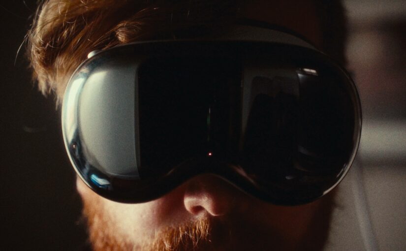
A Peek into the Process | Art Direction

Catlin Baksa

March 8, 2018

Examples in Set Design, Wardrobe, Props, and Food Styling


From set design and color palettes, to styling for a period-piece, to finding a memorable way to represent five new products, here I’ll get into some of our processes and results – detailing specific examples of when and how art direction added value to our films.


SET DESIGN FROM THE GROUND UP

PROJECT: The Office Nemesis
CLIENT: Armstrong Flooring in collaboration with The Anderson Group

The lead role in this narrative script about a fed-up office worker and their arch nemesis was the flooring – resilient, strong, and stylish. With the client, we decided to feature a multi-toned lighter gray flooring with teal threads. We also used a complimentary teal blue flooring to create a “runway” that led to the secondary character in the storyline, The Office Nemesis – a.k.a the printer!

A Peek into the Process: Art Direction

From there, the client provided direction for the office space:

  • Contemporary
  • Clean
  • Inspiring

Setting the scene: Color palette as a base for a dream-like space.

We wanted to create a surreal feel for the office space where this battle between the office worker and their nemesis would take place (because who goes crazy on a printer IRL?). Wanting to keep the backdrop subtle so the floor stood out, we started by creating a neutral color palette of grays and the classic Post-it note yellow. We used the teal blue flooring color as an accent to both complement and draw the eye back to the real star of the show…the flooring!

A Peek into the Process: Art Direction

We selected high-end office furniture and created a layout with a flooring “runway” in mind, designing this prior to moving everything into the space for client review and approval. The teal blue served as a subtle accent in everything from the chair cushions, to the desk decor, to the wardrobe. The desk accessories were selected in whites and teals, and any other office accents were in the base color palette of grays and post-it note yellow. We even designed office artwork in grays and post-it note yellow that perfectly melted in with the post-it note colored walls.

The result: A highly-stylized set with a strong visual identity.

  • Specific color palette
  • High-end office furniture
  • Sleek, clean office decor

… All pointing to the main character: the flooring.

The cohesiveness created from the art direction created a dream-like office space, like it was from another world.  Every cubicle, office supply, piece of office decor – all in its place and balanced… creating a serene backdrop for the chaos to ensue.


WARDROBE AND PROP STYLING FOR A PERIOD-PIECE

PROJECT: Fleet Battle 2.0

CLIENT: Fleet Battle 2.0

Fleet Battle 2.0 is a new video game in need of a promotional release video. Our client approached us with an idea to pay homage to games of the past. Through asking questions in our ideation session, we found they had a clear vision – a fine balance between nodding to the ‘90s and yet having the video take place in present time. We chose to have the props and wardrobe represent the ‘90s, and the use of tablet and smartphone devices represent current day (being the platform on which the games are played).

A Peek into the Process: Art Direction

The other balance was dressing a basement scene that was “unsightly”, yet intentionally curated. We refined the prop selection accordingly. For example, I sought out a variety of items (such as an old vacuum and the “rarely-used suitcase”) to fill the corners of the basement. These would serve as the “obviously forgotten” items basements tend to collect over time.

We had many touch-points with our client throughout the process, including a creating look/feel document based from our ideation session. This helped make sure we were on the same page, from which I made a few notes and a shopping list. After purchasing and compiling the props and wardrobe, I took photos of the inventory along with some suggested prop and outfit pairings to share with the client.

A Peek into the Process: Art Direction


The result: A smooth shoot day where visualization became reality.

Keeping the client informed every step of the way always makes for a smooth shoot day! Knowing what the client preferred, I was able to easily dress the set with the selected props and dress the talent with only minor tweaks. The talent entered the scene, and the client was pleased to see the vision we created together come to life – we were transported to that ‘90s-feeling scene we worked for.

A Peek into the Process: Art Direction


ART DIRECTION + FOOD STYLING = LOOKS & TASTES GREAT

PROJECT: Family of Dressings

CLIENT: Gazebo Room

How do you create recognition when introducing five new products (in this case, salad dressings) in one 30 second commercial? By creating color associations based off of each new product-specific label.

Starting with each flavor’s unique color label, I paired matching dish sets in each color. I then collaborated with the food stylist to determine what recipes would pair best with each dressing – for taste and looks. We selected specific ingredients to complement the color of the dish (and label!). A Peek into the Process: Art Direction

The result: Memorable pairings for a new product line.

Our collaborative efforts resulted in dressing and food pairings that not only taste good, but look good together – using a relational aesthetic for subtle connections and memory recognition.


I hope these examples helped show the value in art direction – throughout the process, while on set, and the results in post.

Be sure to contact us if you’re inspired to collaborate! And feel free to shoot me an email at catlin@makefilms.cc if you’d like to chat about how art direction might further your future film work.


Comments

comment